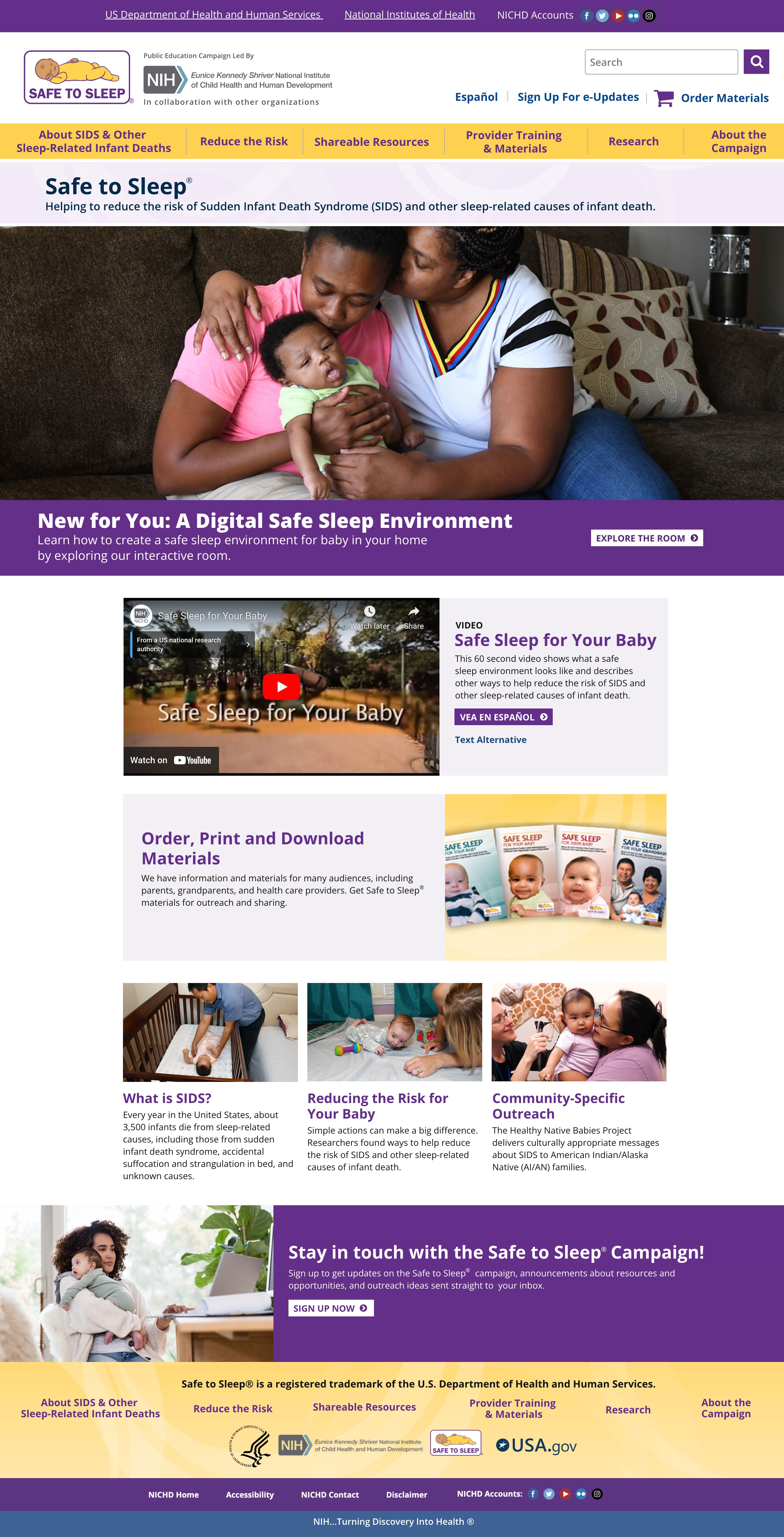
The Safe to Sleep® campaign, led by NICHD (part of the NIH), educates parents and caregivers on reducing the risk of SIDS and other sleep-related infant deaths.
The redesign focused on making safe sleep information easier to find, understand, and act on through clear guidance and accessible, engaging resources for parents and caregivers.
The primary goal of the redesign was to make important safe sleep information easier to find, understand, and act on. Because the website serves audiences with different levels of familiarity with infant sleep safety, the experience needed to communicate essential guidance clearly while making educational resources approachable and engaging.
The design approach centered on creating a user-friendly experience that balances the credibility of a trusted government health resource with the warmth and reassurance needed when communicating sensitive information to parents and caregivers.
1. Simplifying Information Architecture
Organized content into clear categories and intuitive navigation paths, helping users quickly access essential information without feeling overwhelmed by large amounts of educational content.
2. Establishing Clear Content Hierarchy
Used structured layouts, descriptive headings, concise messaging, and prominent calls to action to make important safe sleep recommendations easier to scan, understand, and remember.
3. Creating an Approachable Visual Experience
Focused on a clean, welcoming visual direction that supports readability and builds trust. Thoughtful use of imagery, color, spacing, and typography helps balance the seriousness of the subject matter with a supportive, reassuring tone.
4. Improving Resource Discovery
Emphasized educational materials and interactive experiences, including the Interactive Sleep Room, to help parents and caregivers explore safe sleep environments and access practical guidance.
5. Prioritizing Accessibility
Considered readability, consistent navigation, clear visual cues, and accessible content presentation to help ensure that essential health information is available to a broad audience.
The redesign aimed to make Safe to Sleep® a more approachable and effective educational resource by reducing friction in content discovery and creating clearer pathways to essential information.
By combining intuitive navigation, accessible content presentation, and engaging educational resources, the experience supports parents and caregivers in finding reliable guidance and learning how to create safer sleep environments for their babies.